
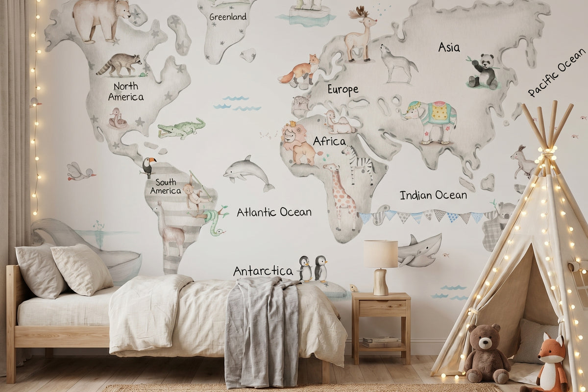
A children's world map can completely transform a bedroom: it creates a focal point, encourages curiosity and makes it possible to build a themed space without filling every wall with visual stimuli. The key is not to add lots of elements, but to decide which piece will carry the visual weight and let the rest of the room support it.
When the world map is integrated with a limited palette, simple textiles and a few coordinated details, the result remains balanced and can evolve over time. This guide offers a practical method for choosing the wall, format, colours and accessories without overwhelming the bedroom.
Quick answer: to decorate a child's room with a world map without making it feel crowded, use one feature wall, repeat only two or three colours from the design and keep the remaining surfaces plain. Add only a few accessories and avoid repeating the same motif on the wall, bedding, pictures and accessories at the same time.
In this guide:
Why does a world map work so well in a child's room?
Because it combines decoration and storytelling in a single piece. A world map provides enough visual information to become the centre of the room, while allowing the furniture and accessories to remain simpler.
Unlike a composition made up of many small elements, one large-format image helps organise the eye. The room feels more coherent when there is a clear hierarchy: first the main wall, then the bed or play area and, finally, the details.
The theme can also accompany different stages. In a baby's room it works as a decorative landscape; later it can connect with animals, travel, continents or places that spark interest. To keep it evergreen, choose a colour base that does not depend on a very specific trend.
Which wall should you choose for a children's world map?
The best wall is the one you see first and can view from a sufficient distance. This will usually be the headboard wall, the side wall beside the bed or a large surface in the play area. It does not necessarily have to be the biggest wall, but it should allow the design to be read without too many interruptions.
1. Look for a visually clear surface
Radiators, tall wardrobes, heavily filled shelving or doors that cut through the illustration can weaken the overall effect. If the wall has several obstacles, choose another location or a smaller format.
2. Decide which piece of furniture will accompany the design
A low bed, bench, chest of drawers or small reading corner can act as a base. The furniture should support the design rather than compete with it, which is why plain finishes and shades already present in the world map work well.
3. Measure before choosing
Proportion matters as much as style. A design that is too small may look lost; one that is too large may hide important areas behind furniture. With products such as the Grey World Map wallpaper mural, the design is adapted to the wall measurements provided, making it easier to preserve the full composition.

A single large-format element can visually organise the entire room.
Which children's world map format should you choose?
The format should respond to the size of the wall, the type of surface and the level of impact you want. Before choosing, decide whether you want to transform the whole wall or introduce the theme in a more contained way.
| Goal | Recommended format | When it works best |
|---|---|---|
| Create a feature wall | Made-to-measure wallpaper mural | On large, uncluttered walls, especially behind the bed or in the play area. |
| Introduce the theme without covering the entire wall | Smaller decorative format | When furniture, openings or the room layout prevent you from using the whole wall. |
| Coordinate several elements | World map on the wall plus plain textiles or pictures | When you want a themed room while keeping the main illustration on only one piece. |
In the children's World Map collection, you can compare murals, textiles and other coordinated pieces. Starting from a collection helps because the colours relate to one another, although you do not need to use every available item.
If you are unsure about measurements, composition or the wall surface, this guide on how to choose a children's mural may also help.
How can you combine the colours of a world map without overwhelming the room?
Choose one base colour, one secondary colour and one small accent. You do not need to reproduce every shade from the illustration elsewhere in the room. The more colours the world map contains, the simpler the furniture and textiles should be.
Use the background as your guide
If the mural has a light base, keeping the remaining walls in off-white, soft beige, pale grey or a muted shade helps preserve a sense of space. The background creates a visual pause and prevents the decoration from competing with the illustration.
Repeat the colour, not necessarily the motif
The bedding can pick up a blue, pink, green or earthy shade from the wall without including another map. This distinction matters: repeating colours creates coherence; repeating too many illustrations creates visual overload.
Reserve stronger shades for small pieces
A cushion, print, basket or wooden detail can add contrast. If the same strong colour appears on several large objects, the world map stops being the focal point and the room loses its hierarchy.
How to coordinate the bed, pictures and accessories
Start with the wall and add the other pieces one at a time. Before buying accessories, identify the purpose of each element: adding texture, repeating a colour, personalising the room or solving a practical need.
- Bedding: plain, with a small print or a related theme, but not an identical one.
- Pictures: one or two are enough if the mural already contains animals, landmarks or continents.
- Names and door plaques: they work well as a personal detail on another wall or on the door.
- Curtains and rugs: they should add texture and colour without becoming a second focal point.
- Play objects: they can reinforce the idea of exploration without needing to remain on display in large quantities.
A simple formula is to distribute visual prominence as follows: 70% neutral base, 20% coordinated colours and 10% accent. It is not a rigid rule, but a useful reference for noticing when the room begins to accumulate too many stimuli.
Three ways to create the composition
Calm option: grey, wood and light textiles
A design such as the Grey World Map can be combined with light wood furniture, white or beige bedding and small details in grey, soft green or blue. It is a flexible choice for a room that should remain relevant for years.
Bright option: blue and natural shades
The Blue World Map provides a starting point for a fresh palette. To avoid an overly themed result, balance the blue with white, sand, natural fibres or wood.
Soft option: dusty pink and neutrals
The Grey World Map with pink background already provides a defined colour base. In this case, textiles can remain off-white, pale grey or very soft pink, reserving prints for smaller pieces.
Common mistakes when decorating with a children's world map
- Repeating maps on too many pieces. One main element is enough to communicate the theme.
- Choosing the design before measuring. The proportion must suit the actual wall and furniture.
- Making every wall a feature wall. A room needs visually calm surfaces.
- Mixing too many illustration styles. Even when they share a theme, the lines and colours may compete.
- Buying accessories without a defined palette. Choosing two or three colours first prevents isolated decisions.
- Forgetting how the room will evolve. A balanced base makes it possible to change textiles and accessories without replacing the main element.
Frequently asked questions about children's world maps
Where does a world map look best in a child's room?
On a large, visible wall with few interruptions. The headboard wall, a side wall or the play area are usually good locations, provided the furniture does not hide important parts of the design.
Will a world map make a small bedroom feel busier?
Not necessarily. One large design can organise the room better than many small pieces. To keep it light, leave the other walls pale and reduce the number of accessories on display.
Is a grey, blue or pink world map better?
It depends on the light and the existing palette. Grey offers a neutral base, blue adds freshness and pink creates a softer atmosphere. The best option is the one that allows you to reuse the furniture and textiles already in the room.
Can you combine a world map mural with patterned bedding?
Yes, as long as the patterns do not have the same visual weight. If the wall is highly detailed, choose bedding with a more spaced-out print, a different scale or a reduced palette.
How many colours should you repeat?
Two or three are enough. One base colour, one secondary shade and a small accent create continuity without copying the whole illustration.
How can you make the decoration last for more years?
Choose an illustration that is not tied to a specific age and use accessories that are easy to replace. This way, the wall can remain while the bedding, pictures or study area change.
One feature wall, a more coherent room
Decorating with a children's world map does not mean turning the entire bedroom into a travel theme. It means choosing a visual starting point and building around it with restraint. A well-designed wall, a short palette and a few coordinated elements are usually enough to create a personal, balanced space that is easy to update.
Explore the Il Mondo di Alex World Map collection and compare the designs according to the measurements, colours and actual layout of the room.

Leave a comment
All comments are moderated before being published.
This site is protected by hCaptcha and the hCaptcha Privacy Policy and Terms of Service apply.